Root Redwing 7

rootkraken-f7

Root Redwing and the Thieves of Kettle Bay

Those eyes! Even grumpy Root can’t resist.

Technical note: the texture on the octopus’s skin and the bubbles were created by using the brush setting (in the brushes panel) for “spattering”. If you’re learning Photoshop (as I still am and probably will always be), play with the brush settings on a blank canvas—it’s really fun and you’ll discover stuff like this!

Root Redwing 4

rootkraken-f4

Root Redwing and the Thieves of Kettle Bay

Night has fallen and this is getting spooky! What has Root found in her boat? Did she forget and leave the microwave on while cooking up some marshmallows for s’mores?

Another technical Photoshop note, for those who may be interested: you might have noticed those soft fuzzy edges to the panels. It’s easy-peasy; just select the white area around the panels; if you already have outlines, head up to the Select menu and find Modify>Expand, and set the pixels to enough to cover up your lines.

Then go back to (or if you don’t have outlines, just start at) the Select menu and find Modify>Feather and set the pixels for the feathering to your own taste; I think I used 10 here. Then Edit>Fill with white, and you’ll have these lovely soft edges!

Root Redwing 2

rootkraken-f2

Root Redwing and the Thieves of Kettle Bay

Happy New Year, everyone! I hope it will be full of good things, resolutions realized, and creativity for you!

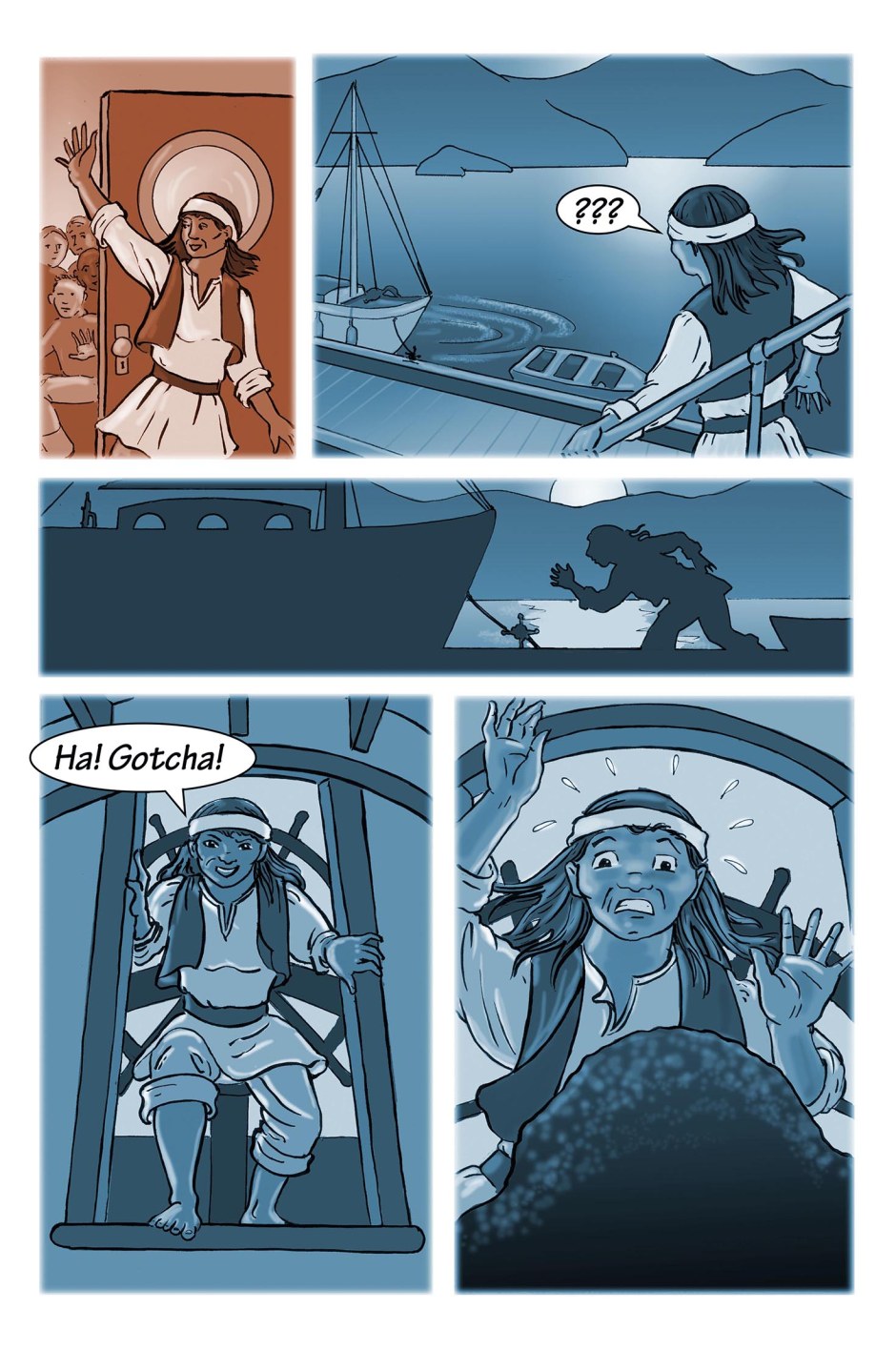
Speaking of creativity, you may have noticed by now that this comic has quite a different look to the main story. Whenever I do a short project like this, I like to challenge myself to try something I haven’t done before. In this case, it was to use digital greyscale (but wait! it isn’t grey—don’t worry, I’ll get to that later). I also used digital lettering, which I’ve done before, but not for a while, so it’s good to keep those skills up.

The comic was drawn somewhat larger than I usually work for Mermaid Music, and inked with a brush-pen (sort of like a cartridge writing pen, but with a brush instead of a pen nib), which was the reason I drew it larger—it takes a lot of control to work small with that tool, and I figured I’d give myself all the advantage I could. Still, when I initially finished the inks, I hated them! But going back and looking at the originals now, I’m much happier. Sometimes you have to get a little distance from your own work, and forgive yourself for the imperfections.

I scanned the inks (as tiffs) to Photoshop, cleaned them up a bit (there is always paper tone to get rid of, and, oh my, there’s an ink splotch, and arg, a fingerprint!), and settled down to figure out how to add the tones. I set the mode to greyscale, added a layer to do the “colouring” on, and then started selecting areas to drop in the major tones and gradients. I used several different methods to select for this, which I won’t bore you with here (if you’re learning Photoshop, and want to know more of the gory details, ask me in the comments, I’m happy to answer if anyone is actually interested).

A note about layers—if you’re not familiar with Photoshop or other image-editing programs, visualize a bunch of transparent sheets of acetate (which is how we used to do it in the bad old days), which can be re-ordered, made more or less opaque, and made to affect the other layers in different ways.

Then I added another layer, and sometimes two, and proceeded to do some brushwork, adding shadows and highlights. This gave it a more natural look than if I’d just stuck with the flat colours.

I added the lettering right in Photoshop. Usually I do it in Indesign, but I wanted to test out Photoshop’s capabilities. It involved a lot of layers, which got confusing rather fast, (though I did figure out why one would want to group layers)—I think next time I’ll stick to Indesign for a longer project; however, the convenience of just doing it all in one program makes using the Photoshop tools worthwhile for only a page or two.

For the final image, I made a copy and flattened all the layers, made sure to delete any channels that were still lingering from saved selections (these can play havoc with trying to view the file in anything but Photoshop), and the final tiff was then ready for publication in Cephalopods, the first Kraken Komiks anthology.

I wanted a bit more colour for online, though, so back to Photoshop—first, I changed the mode back to RGB. Then I made an extra layer and set it to “overlay”, then filled that layer with the colours I wanted. Overlay is cool, because the colour you use affects the main layer in proportion to the lightness or darkness of each area. So if an area is white it doesn’t show up at all, and if it’s dark, it makes it a dark version of the selected colour. I’ve only tried this with greyscale (I used it to “sepia-ize” a whole book’s worth of pencil drawings), and I just realized that I don’t know what this would do to a colour image. I’ll put that on the list for future experimentation.

Why not just colour the whole comic? Well, several reasons. First, I really liked the look of the greyscale, and wanted to keep a limited-palette feel; second, the sepia (and soon blue tones) echo the flashback and night/underwater sequences of the main comic; and third, fully colouring it would have been every bit as fiddly as doing the greyscale in the first place, and would have taken ages, and this is supposed to be giving me a vacation!

Well, that’s enough about me and my comic—if you’ve gotten this far, and want to know more, please ask me a question and I’ll do my best to answer!

Spring Forward—Ack! I Tripped!

Hi folks, there will be a slight delay in this week’s Mermaid Music — I’ll be posting tomorrow (Tuesday) instead of today. All kinds of things have been happening here — new projects, new neighbours, tons of events— and, well, I’ve burned through my buffer again. Never fear, however; we’ll be back on track with a proper Monday post next week.

The most exciting project with relevance to this comic is that I’ve just completed an eight-page story about Root Redwing in her younger days for an anthology by Kraken Komiks, a group of comics creators that I hang out with here in Victoria, BC. Here’s a panel with an actual MERMAID to make up for you having to wait until tomorrow for the next instalment!

Root encounters a young mermaid and her pet octopus! Like dogs, octopuses should be well trained.

Root encounters a young mermaid and her pet octopus! Like dogs, octopuses should be well trained.

It was drawn in ink, with brush-pen, somewhat larger then I usually work, then coloured digitally in greyscale with Photoshop (which took way longer than watercolour, by the way — but I’ve been doing watercolour for about a million years and digital only a couple). I learned a lot doing it though, as I did a lot of experimenting to get it to look the way I had envisioned it. I’ve worked very little in greyscale, either digitally or traditionally; it’s always been straight black-and-white or full colour for me. This was harder than either!

If you’re interested in what else I’ve been up to the last month or so, head on over to my main blog, Karen Gillmore Art! I’ll post more about the upcoming anthology soon; the theme is cephalopods, and it will be in print around the middle of April! I’m also planning to have a new print issue of Mermaid Music out by Mid-May, so stay tuned.

UPDATE: Well, the new page is posted, and technically, it’s still Monday (it’s 11:35pm). Hope it was worth the wait!

Interlude: A Map of the Westwind Isles

A Map of The Westwind Isles: from the Redwing Archives

A Map of The Westwind Isles: from the Redwing Archives

What fantasy story would be complete without a map? Since Sami is setting off on her voyage, the first order of business for me was to make a map so we can follow along! I’ll put this in its own tab at the top of the page so that it’s easy to find when you need to see where the action is taking us.

I had a lot of fun making up names — in fact, I had to restrain myself so that I didn’t name every little islet! There are actually a lot of little towns and villages scattered among the islands, but if I started naming them all, you wouldn’t be able to see the map. So  I just stuck with places that will be relevant in the story (probably — we may not get to places like Bear Lake, in this story arc, anyway).

Apart from the original sketch, I made this map entirely in Photoshop. I’m still quite a newbie at it, and every time I use it, I find something new to do with it. This time I figured out how to make my lettering do an arc shape. And I tried a new blending mode for the mountains layer. Hooray! Knowledge increases!

And yes, I know I used Papyrus for a font; but I like it, so there. I may eventually do a handmade version of this, in which case it will be hand lettered.

The actual story will resume on Friday, and I’ll be posting Mondays and Fridays, as I did for the first chapter. Stay tuned!

Cartography, At Last

I love drawing maps. As a kid I drew pirate maps on old brown grocery bags, burning the edges to make them look old (with Mom’s help). In geography class, I lived for the feel of onionskin tracing paper, and the traced and coloured maps we were assigned. I had great fun recently making an updated map for Elizabeth Ann Scarborough’s Seashell Archives series. And at last I get to make one for my own world, the world of Mermaid Music.

I’ve had the shape of what the world looks like, or at least Sami’s little corner of it, in my mind for some time. Those familiar with the area around the west coast border of British Columbia and Washington State may recognize some influences here, though I’ve kept it very loose (I didn’t even look at a map because I didn’t want to get too close). My concept of the islands trade and the voyage The Mermaid will be taking grew out of the landscape of my home, on what we call the Salish Sea, which includes all the straits, sounds, and bays between our islands and the mainland, so it seemed a natural place to start.

This drawing was entirely made in Photoshop, based on a pencil sketch. There's still a lot of work to do, to give the land some more form, add place-names, a compass, and maybe a couple of "here there be dragons" kind of things!

This drawing was entirely made in Photoshop, based on a pencil sketch. There’s still a lot of work to do, to give the land some more form, add place-names, a compass, and maybe a couple of “here there be dragons” kind of things!

This drawing is a work in progress of the area where the next bit of the story will take place, or at least start. The Mermaid and her crew will be heading even further south, and I’ll expand the map as we go. As for names, I have a few, though the map is only roughed in, so I haven’t written them in yet. I’ll present a more finished version soon. (UPDATE: there is now a “map” tab in the top menu bar!)

Sami’s home is the island near the top with the two lakes. The little round bay on the west side of the island (assume standard map directions) where the two rivers come to the sea is Moon Bay, where the action so far has been taking place.